In this post, I’ll demonstrate how to estimate ancestry proportions using one of the most widely used tools in population genetics: ADMIXTURE. ADMIXTURE is a model-based clustering algorithm that infers individual ancestries from multilocus SNP genotype datasets.
Preparing the Dataset
Download the appropriate ADMIXTURE binary and either place it in your dataset directory or make it globally accessible. For this run, I included a subset of West Asian populations along with a few adjacent populations (around 150 samples in total). Linkage Disequilibrium (LD) pruning was applied beforehand. If you’re unsure how to prune your dataset, refer to the previous post.
Even after pruning, my dataset still contained over 140,000 SNPs. Since ADMIXTURE can be memory-intensive, especially given that multiple runs are often needed for interpretation, it’s a good idea to reduce the dataset further using PLINK’s --thin-count flag. This randomly subsamples SNPs and significantly speeds up ADMIXTURE runs.
Example: thinning to 50k SNPs:
plink --bfile admix.data.pruned --thin-count 50000 --make-bed --out admix.final
This will produce a PACKEDPED-format dataset (.bed/.bim/.fam) with 50,000 randomly selected SNPs.
Running ADMIXTURE
ADMIXTURE supports both unsupervised and supervised modes. In this post, I’ll focus on unsupervised runs. Given a user-defined number of ancestral populations (K), ADMIXTURE attempts to assign ancestry proportions by maximizing within-cluster FST.
Basic run (for K = 6):
# ADMIXTURE expects a .bed file as input
# Running with 8 threads
./admixture -j8 admix.final.bed 6
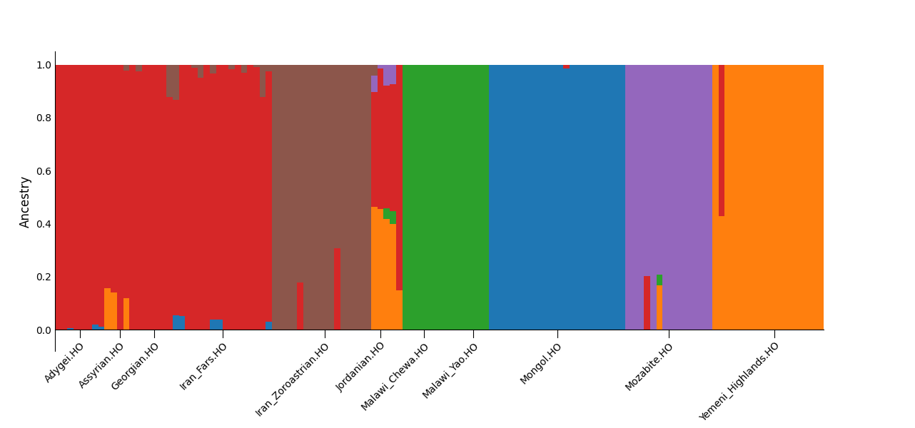
There’s no definitive way to choose the right number of ancestral components (K); it usually involves a combination of testing and intuition. While ADMIXTURE supports cross-validation (--cv), in practice, evaluating the plausibility of inferred components tends to be more informative. Overfitting (too many Ks) often results in arbitrary splits of populations. For example, in my test dataset, K=7 caused the Mongol samples to split into two distinct components, probably reflecting internal structure, but for most purposes this was excessive, since there’s no clear indication of what that split represents for this dataset.
For my K=6 run, I expected the following components:
- Northern West Asian component
- Divergent Zoroastrian component
- North African component (peaking in Mozabites)
- Sub-Saharan African component (peaking in Malawi)
- East Asian component (peaking in Mongols)
- Southern West Asian component (peaking in Yemeni Highlanders)
Keep in mind: a higher K does not guarantee the appearance of desired or known populations. Component formation depends on statistical divergence, not geography or labels. Also, each population should ideally include several individuals to allow ADMIXTURE to reliably form components based on shared structure.
Output Files
ADMIXTURE generates:
.Q– ancestry proportions per individual (aligned with rows in the.famfile).P– allele frequencies per component and SNP (aligned with the.bimfile)
ADMIXTURE does not name the components. You’ll need to interpret them based on which populations they peak in. For example, if the first 10 individuals are Mozabites and they all share a high value (>0.95) for a single component, that component likely reflects North African ancestry.
Plotting a Bar Plot
To interpret ADMIXTURE’s output visually, we’ll plot the .Q file, which contains ancestry proportions for each individual in the dataset. Each row corresponds to a sample in the .fam file, and each column to one of the inferred components (K).
To make the plot more readable, we’ll group samples by population using a labels file - one line per sample, aligned with the .fam file.
If you haven’t created a labels file for your current subset, see Performing PCA on Genetic Data Using PLINK for a quick method. In short:
# Adjust the .ind to your prefix
awk 'NR==FNR {map[$1]=$3; next} {print map[$2]}' v62.0_HO_public.ind admix.final.fam > labels
This command matches each individual in the .fam file to their population label from the .ind file (column 3), creating a label file that aligns row-wise with the ADMIXTURE output.
Once you have the .Q file and the labels file, you can use the Python script below to plot the ADMIXTURE proportions as a bar plot grouped by population. If you don’t have a Python environment with the required libraries yet, set one up in your ADMIXTURE output folder:
# Create and activate a virtual environment
python3 -m venv venv
source venv/bin/activate  # On Windows: venv\Scripts\activate
Then install the dependencies:
pip3 install numpy pandas matplotlib
Now save the script below as barplot.py, adjust the configuration parameters at the top:
import numpy as np
import pandas as pd
import matplotlib.pyplot as plt
from collections import defaultdict

# --- Configuration ---
q_file = "admix.final.6.Q"        # Path to your .Q file
labels_file = "labels"            # Path to your labels file
figsize = (20, 6)
label_fontsize = 10
min_group_size = 3                # Only show label if group size ≥ this
bar_width = 1.0

# --- Load data ---
Q = pd.read_csv(q_file, sep=r"\s+", header=None)
labels = pd.read_csv(labels_file, header=None)[0]
assert len(Q) == len(labels), "Mismatch between Q rows and labels"

# --- Sort by labels to merge same-pop groups ---
sorted_idx = labels.argsort()
Q_sorted = Q.iloc[sorted_idx].reset_index(drop=True)
labels_sorted = labels.iloc[sorted_idx].reset_index(drop=True)

# --- Compute new plotting indices ---
N, K = Q_sorted.shape
x = np.arange(N)

# --- Set colors ---
if K <= 10:
    cmap = plt.get_cmap("tab10")
    colors = [cmap(i) for i in range(K)]
elif K <= 20:
    cmap = plt.get_cmap("tab20")
    colors = [cmap(i) for i in range(K)]
else:
    # continous map for K > 20
    cmap = plt.get_cmap("hsv")
    colors = [cmap(i / K) for i in range(K)]

# --- Plot bars ---
fig, ax = plt.subplots(figsize=figsize)
bottom = np.zeros(N)
for k in range(K):
    col = Q_sorted.iloc[:, k].to_numpy()
    ax.bar(
        x,
        col,
        bottom=bottom,
        color=colors[k],
        width=bar_width,
        linewidth=0,
    )
    bottom += col

# --- Group and label if ≥ min_group_size ---
group_positions = defaultdict(list)
for idx, label in enumerate(labels_sorted):
    group_positions[label].append(idx)

for label, indices in group_positions.items():
    if len(indices) >= min_group_size:
        mid = (indices[0] + indices[-1]) / 2
        ax.plot([mid, mid], [-0.03, 0], color="black", lw=0.8)
        ax.text(
            mid,
            -0.04,
            label,
            ha="right",
            va="top",
            fontsize=label_fontsize,
            rotation=45,
            rotation_mode="anchor",
        )

# --- Final styling tweaks ---
ax.set_xlim(-0.5, N - 0.5)
ax.set_ylim(-0.08, 1.05)
ax.set_ylabel("Ancestry", fontsize=12)
ax.set_xticks([])
ax.set_yticks(np.linspace(0, 1, 6))
ax.tick_params(axis="both", length=0)
ax.spines["top"].set_visible(False)
ax.spines["right"].set_visible(False)
ax.spines["bottom"].set_position("zero")
plt.subplots_adjust(left=0.06, bottom=0.18)

plt.show()

# To save instead of displaying, comment out plt.show() and uncomment the line below:
# plt.savefig("admixture_plot.png", dpi=300, bbox_inches="tight")
Finally run it with:
python3 barplot.py
After running the script, you’ll have a visual representation of your ADMIXTURE results with individuals grouped by population and colored by their inferred ancestry components.
Here’s the bar plot generated for my West Asian subset at K=6: